Overview
Logo |
|
Primary Color

Use: Light backgrounds.
Primary White Inverse  Use: color backgrounds | Primary Color Inverse 
|
Logo clear space
To maintain the integrity of the logo and to prevent overcrowding in compositions, a minimum space around the logo should be kept clear from other graphics. This area of isolation allows the logo to stand out by ensuring that any copy, additional identities, or other visual elements are kept clear from the Gladly logo. The clear space, defined as “x,” is illustrated on this page. The measurement is relative to the size and applies to all four sides around the logo.
Primary lockup  | Mark  | Logotype  |
Dos and don’ts
|

 Do not alter the color of the logo |  Do not substitute the Gladly typeface for another |  Do not warp, stretch, squash, or tilt the logo |
 Do not place the logo inside a container device |  Do not change the logo lockup |  Do not rearrange elements within the logo |
 Do not fill the logo, or elements of the logo |  Do not add effects or treatments to the logo |  Do not place the logo on a complicated background |
Do not fill the logo, or elements of the logo |
Colors
|
Primary color palette
Our primary color palette is vibrant, optimistic and heroic. Green is our primary shade, with complimentary colors of black, white, and grey. |

RGB: 0 155 0 PMS: 368 U HEX: 009B00 | 
RGB: 255 255 255 PMS: N/A HEX: FFFFFF | 
RGB: 13 13 13 PMS: Black 6 C HEX: 0D0D0D |

RGB: 37 37 37 PMS: Neutral Black C HEX: 252525 | 
RGB: 243 243 243 PMS: P 179-1 C HEX: F3F3F3 |
Secondary color palette
Our secondary color palette offers a vibrant purple as a premier accent as well as lighter tints of purple and green that can be used in supporting elements throughout the brand. |

RGB: 140 105 240 PMS: 368 U HEX: 8C69F0 | 
RGB: 197 179 248 PMS: 942 U HEX: C5B3F8 | 
RGB: 211 202 235 PMS: 9360 U HEX: D3CAEB |

RGB: 205 239 205 PMS: 9560 U HEX: CDEFCD | 
RGB: 213 242 232 PMS: 9520 C HEX: D5F2E8 |
Decks
Color palette for decks only. |

HEX: 0D0D0D | 
HEX: FFFFFF | 
HEX: 4A4A4A |

HEX: AAAAAA | 
HEX: 8C69F0 | 
HEX: F3F3F3 |
HEX: F3F3F3 | 
HEX: CEEFCD | 
HEX: C5B3F8 |

HEX: 8C6AF0 |
HEX: 0D0D0D | 
HEX: FA183C |

HEX: FFBE00 |
Usage & guidelines
Gladly Green is the hero color and should be used intentionally rather than applied everywhere. Brand colors on the logo and core assets should never be altered. The primary palette should dominate any design, with the secondary palette serving as supporting contrast to add visual interest. When creating presentations, always use the deck-specific palette to ensure consistency across slides. |
Typography |
Primary typeface – Chalet
The Chalet font family has been chosen as the Gladly brand typeface for its character and versatility. The face strikes a balance between a clean functional aesthetic and a friendly, optimistic feel. |
Headlines, paragraphs or subheads  | Specific instances where prominence is required  |
Usage & guidelines
When Chalet cannot be embedded or is unavailable, use system fonts as specified in our fallback guidelines to preserve readability and brand integrity. |
Hierarchy
This is a reference for how to successfully create typeface scale hierarchies. This is a guide for how to maintain legibility when there are multiple levels of information. |
Alternate typeface – Helvetica Neue
Helvetica Neue has been chosen as the | Headlines, paragraphs or subheads  |
Photography
Overview
|

Customer tone
Honest |
| Reliable |
|
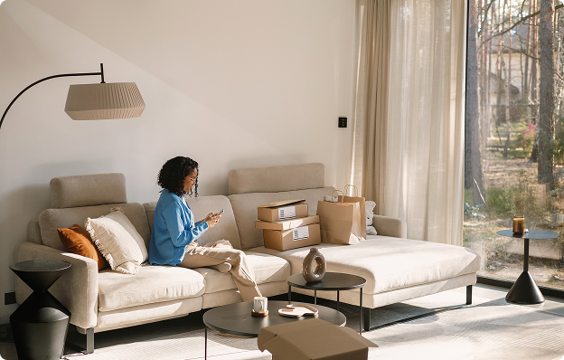
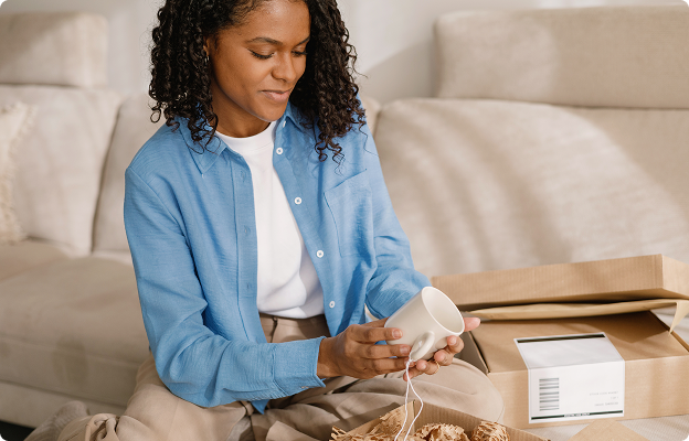
Customer shots should feel in-the-moment and honest, with high production value. Clean, natural lighting and slightly shallow depth of field will help create an uplifting and positive tone, while simple styling and propping will help keep the focus on the subject. | Customer shots should feel in-the-moment and honest, with high production value. Clean, natural lighting and slightly shallow depth of field will help create an uplifting and positive tone, while simple styling and propping will help keep the focus on the subject. |
 |  |
Scenes
Our photos should always showcase customers interacting with premium brands in an authentic way, across a range of modern scenarios and locations. Scenes should vary across appropriate locations, devices, demographics, and ethnicities. | When possible, additional propping (such as a box to represent an order or luggage to represent travel) should be included as an alternate shot, to allow for flexibility in later applications/communications. |
 |  |
Composition
To “crop” an image is to remove or adjust the outside edges of an image (typically a photo) to improve framing or composition, draw a viewer’s eye to the image subject. |
 |  |
Agent tone
Empowered |
| Positive | Heroic |
Agent photography should showcase representatives in a way that presents their job positively and heroically. This will help to elevate settings and poses that may otherwise appear “stock-like”. | Special considerations should be made to the lighting and focus to align them with the consumer lifestyle photography. Combined with clean, simple propping, this will bring warmth to settings that are likely to have less natural light and can often feel cold. |
 |  |
Iconography
In the instances that icons are needed, there are two styles that serve as a guide for their future creation, dependent on both context and content. Channel icons
|
Channel icon example

Monoweight icons
|
Monoweight icon example
Website styling
Grid structure
The Gladly Design System uses a padding and spacing scale of 4px. Wherever possible, using increments of 4px when creating padding distances between elements and components. | The site is built to be responsive across a number of breakpoints, but consideration should be given to how content is displayed, scales & reformats at mobile sizes. |

Surfaces
Surfaces define the layers and depth of our visual hierarchy. They create distinction between background elements, content containers, and interactive components. |
Primary default  Use: main colors | Primary inverse  Use: main colors, used more sparingly |
Primary inverse Use: main colors, used more sparingly | Primary color  Use: color backgrounds |
Secondary color  Use: main background color for data or infographics | Secondary color  Use: main background color for product illustrations |
Secondary color Use: main background color for product illustrations | Secondary color  Use: secondary background color for product illustrations |
Text
Text styles establish visual hierarchy and readability across all Gladly communications. Our type system defines consistent sizes, weights, and spacing that guide readers through content with clarity and ease. From headlines that capture attention to body copy that informs, each text style serves a specific purpose in our typographic hierarchy. Proper application of these styles ensures our message is always accessible, scannable, and aligned with our brand voice. |
Text Examples

Buttons
Default
Buttons are the primary call-to-action elements that drive engagement and guide users through key interactions. Our button system includes clear visual states—default, hover, active, and disabled—that provide intuitive feedback and reinforce usability. |
Inverse
Buttons are the primary call-to-action elements that drive engagement and guide users through key interactions. Our button system includes clear visual states—default, hover, active, and disabled—that provide intuitive feedback and reinforce usability. |
Our Gladly highlight graphic
The Gladly Highlight is a deliberate emphasis tool used sparingly within headlines or subheads to call attention to a single key term or a short 2–3 word phrase. It’s designed to sharpen meaning and guide the reader’s eye—never to decorate or overwhelm. |

 |
 |
 |
 |
|
 |
Usage of name
Corporate name
|
Tone
Unlike voice, our tone is situational. It changes depending on the context.
Our tone is professional yet relaxed, and playfully relatable.
When appropriate, we inject levity while delivering value.
We present ourselves as leaders and experts in everything related to customer experience.
Spectrum of tone
The tone of our writing typically falls between functional and expressive, depending on the medium.
Functional writing
Clear and straightforward. Organizes information to anticipate our audience's needs and ensures they have a satisfying user experience.
Expressive writing
Fresh and interesting. Writing that puts our personality on display in an unexpected and memorable way.
Words to use carefully
Use these only in educational contexts and/or when you can briefly define them.
buyer journey | conversion |
Words to avoid
Avoid using the following words in our marketing collateral or communication.
Internets, interwebs, or any other colloquial variation of the word "internet"
Ninja, rockstar, wizard, or unicorn to describe a unique individual or company (unless referring to a literal ninja, rockstar, wizard, or unicorn)
Young, old, or elderly in the context of someone's age
Crushing it, killing it, taking a stab at it, flush out, pow-wow, hustle or any other casual lingo
Crazy, insane, or similar words
Blacklist, whitelist, grandfathered, slave, master, deaf, blind, and any other subtle or blatant racist or ableist terms
Enable or disable—use 'activate' or 'deactivate' instead where possible. You can also use 'allow' when describing the ability to do something. Other synonyms include 'permit' and 'empower.'
Also avoid
Deflection (as a positive)—use "resolution" instead
Interaction—use "conversation" instead
Ticket, case, contact—use "customer" instead
Agent, rep—use "team" or "team member" instead
Chatbot, bot, virtual agent—use "customer experience AI" instead
Handle, process—use "help," "serve," or "resolve" instead
Writing rules
Use the active voice
Always use sentence case for headlines (no periods)
Contractions encouraged for friendly tone
Minimal exclamation points
Gladly is never possessive—it's Gladly, not Gladly's
Spell out acronyms first (CX, LTV)
Trademark symbol (®) for Gladly
Investors
When mentioning investors:
Always use this official list.
When referring to them as a group, include all names on the list—never leave anyone out.
Official logo |  |  |  |
Official name | Riverwood Capital | Future Fund | Atlantic Vantage Point |
Official logo |  |  |  |
Official name | Greylock Partners | New Enterprise Associates | Notable Capital |
Media kit & contact
For press inquiries, brand assets, or partnership opportunities, please contact our brand team.
media@gladly.ai
Download media kit