

The ecommerce landing page optimization checklist
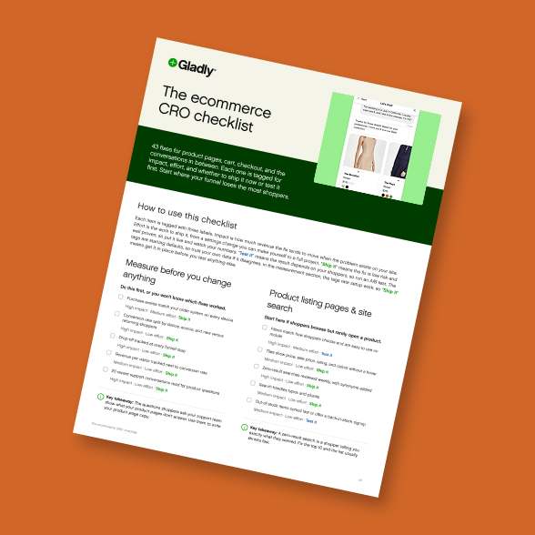
The ecommerce CRO checklist
43 conversion fixes across product pages, cart, checkout, and shopper conversations, each ranked by impact and effort so you know what to ship and what to test.

Updated: 10/16/26
A landing page is wherever a campaign sends people. For an online store, that’s usually a product page or a collection page, and only sometimes a page built for the campaign. Most landing page checklists are written for lead-gen pages with one job (get the form filled), so they tell you to strip the navigation and keep a single button. A shopper who clicked an ad for a jacket often wants to compare colors, check the size chart, and look at two other jackets before buying, so the one-button lead-gen rules don’t hold up.
This checklist is built for paid, email, and social traffic landing on a store. It follows one campaign from the same fictional apparel brand we used for customer acquisition cost, with an $80 average order: a paid social ad for a spring rain jacket at 20% off. Run through it before each campaign launch, and fix whatever fails before you spend the budget.
Pick the right destination for each campaign
The first decision is where the click goes, and it’s the one most checklists skip. A great page is still the wrong page if it makes a shopper hunt for the thing the ad showed them.
Product page
Send traffic to the product page when the ad features a single product, when you’re retargeting someone who already viewed it, or when the audience knows what it wants. The page already has the price, the variants, reviews, and the add-to-cart button, so there’s nothing to build.
Collection page
A collection page fits category ads, broad offers like “20% off outerwear,” and audiences who are still comparing. Pre-filter or sort it to match the ad, so the products in the creative are at the top. A broad offer that lands on an unsorted grid of 140 items makes the shopper do the ad’s job.
Dedicated campaign page
Build a campaign page for launches, bundles, quizzes, and gift guides, when the story needs more room than a product page gives it. It’s also a page you have to build, QA, and keep current, and it goes stale the day the promotion ends. Use one only when a product page can’t tell the story.
For the rain jacket ad, the click goes to the jacket’s product page with the color from the ad already selected. The homepage and the full outerwear collection both lose the shopper’s attention before they find the jacket.
When to keep the navigation
Lead-gen advice to remove the navigation comes from pages with one possible action. Store shoppers browse, and a shopper with no way to get to the other jackets, the size guide, or their cart is more likely to leave than to buy the one item in front of them. Keep the main navigation and the cart. Take out the distractions first: the pop-up that fires on arrival, the sitewide banner for a different sale, the carousel promoting last season, and any countdown timer that isn’t tied to a real deadline. If you think stripping the navigation would help your store, test it on your own traffic first.
Before launch, check:
Each campaign has a destination chosen on purpose: product page, sorted collection, or campaign page.
Single-product ads land on that product with the advertised color or variant preselected.
Collection links are filtered or sorted so the advertised products show first.
The main navigation and cart are still there.
Arrival pop-ups and unrelated banners are off on campaign destinations.
Match the page to the ad, email, or post that drove the click
Shoppers check quickly whether a page delivers what the ad promised. Nielsen Norman Group calls this information scent: people follow cues that suggest they’re on the right path, and they leave when the cues stop matching. Google Ads builds the same idea into its scoring. Landing page experience is one of the three Quality Score components, and Google’s own example says a shopper who clicks an ad for flannel shirts should land on your flannel inventory.
Same product, same price, same offer
The headline on the page should repeat the ad’s promise in close to the same words. The hero image should show the product in the color from the creative. If the ad says 20% off, the page has to show the discounted price before the cart, because a shopper who only sees the full price on the product page will assume the offer doesn’t apply and leave. In email this matters even more, since the subscriber clicked on a specific promise and expects to see it the moment the page loads.
Carry the promo code and check stock before launch
Where your platform supports it, apply the discount through the link so nobody has to remember a code at checkout. Then check inventory. If the ad shows the jacket in olive and olive is sold out in medium and large, you’re paying for clicks that can’t convert. Pause ads tied to sold-out variants, and give limited-time offers a real end date so the page doesn’t keep advertising a sale that ended Sunday.
Before launch, check:
The page headline echoes the ad, email subject, or post copy.
The hero image shows the product and color from the creative.
The advertised price or discount appears on the page before checkout.
Promo codes apply automatically from the link where your platform allows it.
Every advertised size and color is in stock at launch.
Ads pause automatically or by a named owner when a featured variant sells out.
Limited-time offers have an end date, and the page changes when it passes.
Above-the-fold essentials, on the phone first
Most of the attention goes to the first screen. In NN/g’s eyetracking research, 57% of viewing time went to content above the fold, and 74% to the first two screenfuls. For most campaign traffic, that first screen is a phone. In Unbounce’s 2024 Conversion Benchmark Report, 83% of landing page visits in its sample came from mobile devices. That’s vendor data from Unbounce’s own customers, so check your own analytics for the device split on your campaign traffic.
So design the first phone screen as the page, and treat everything below it as backup. On that screen a shopper should see the product and the price, the offer from the ad, the add-to-cart button (or a sticky add-to-cart bar that stays on screen as they scroll), and one line of reassurance about shipping, returns, or ratings. Push down or remove anything that delays those: autoplaying carousels, a full-screen email pop-up in the first few seconds, and lifestyle hero images that don’t show the product.
Before launch, check:
The product, price, and offer are visible on the first phone screen without scrolling.
The add-to-cart button is on the first screen, or a sticky add-to-cart bar appears on scroll.
One trust line (shipping, returns, or rating) sits near the button.
No full-screen pop-up fires in the first few seconds on campaign traffic.
No autoplaying carousel holds the top of the page.
Buttons and variant pickers are big enough to tap with a thumb.
Someone has checked the page on a real mid-range phone over a cellular connection.
Page speed and Core Web Vitals
Speed advice usually stops at “make it fast.” Google publishes the actual targets. Core Web Vitals are three measurements of loading, responsiveness, and visual stability, and a page passes when 75% of real visits meet the “good” threshold, measured separately for mobile and desktop.
Core Web Vitals thresholds
Metric | What it measures | “Good” at the 75th percentile |
|---|---|---|
Largest Contentful Paint (LCP) | How fast the main content, usually the hero image, appears | 2.5 seconds or less |
Interaction to Next Paint (INP) | How quickly the page responds to taps and clicks | 200 milliseconds or less |
Cumulative Layout Shift (CLS) | How much the layout jumps while the page loads | 0.1 or less |
Each one maps to something specific on a store page. LCP is usually the hero product image, so an oversized, uncompressed photo is a common reason it fails. INP shows up when a shopper taps a size or color and the page takes a beat to respond, or when the add-to-cart tap lags. CLS is the add-to-cart button jumping down the page because a review widget, a promo banner, or an app embed loaded late and pushed it. On the rain jacket page, those are the olive hero photo, the size buttons, and the review widget below the price.
Google’s case studies on the business impact of Core Web Vitals include Lazada, which saw a 16.9% increase in mobile conversion rate after improving LCP, and Cdiscount, which improved all three metrics and credited them with a 6% revenue lift during its Black Friday sale.
To see where you stand, run campaign URLs through PageSpeed Insights, which shows field data from real Chrome users when a page has enough traffic, and check the Core Web Vitals report in Search Console, which groups similar pages together. Watch your apps, too. Every review, upsell, loyalty, and chat app adds script, and the product pages your ads point to often carry more of it than any other page on the site. Our ecommerce CRO checklist covers sitewide speed fixes, so this list sticks to campaign pages.
Before launch, check:
Campaign URLs pass LCP, INP, and CLS on mobile in PageSpeed Insights field data (or lab data, for new pages without enough traffic).
The hero product image is compressed, correctly sized, and not lazy-loaded.
Space is reserved for review widgets, banners, and embeds so they don’t push the button down.
Variant pickers and add-to-cart respond on the first tap.
Someone has listed every app that loads on campaign product pages and removed the ones that don’t earn their place.
Speed gets rechecked after any new app, theme change, or major promotion banner goes live.
Copy and CTA clarity
A product page has one primary action, and it’s add to cart. The size guide, reviews, other colors, and a wishlist button all support that action, and none of them should look like they compete with it. Make the add-to-cart button the highest-contrast element on the screen, and put it where a thumb can reach it.
Make button copy specific. “Shop now” makes sense on an ad, but on a page that’s already the product, it tells the shopper nothing. “Add to cart, ships Thursday” answers a question they had. Keep the words consistent across the whole path, too. If the rain jacket ad says “Get 20% off,” the banner and the price on the page should say 20% off in the same terms, and not switch to “spring savings” or a dollar amount the shopper has to check against the ad.
Before launch, check:
One primary action per page, styled as the most visible element.
Button copy says what happens next, and adds delivery timing if you can promise it.
The offer uses the same wording and numbers in the ad, on the page, and in the cart.
Headlines and product descriptions are written in plain words a shopper can scan in a few seconds.
Secondary links (size guide, reviews, other colors) are visually quieter than the main button.
Answer the questions paid visitors arrive with
Paid social and display visitors are colder than shoppers who arrive through search or email, or come back on their own. A lot of them don’t know your brand yet, and they show up with the same few questions. Will it fit? When will it arrive? Can I return it if it doesn’t? Will it work with what I already have? Every one of those that goes unanswered is a reason to close the tab.
Put the answers on the page
Put sizing help next to the size selector, so a shopper doesn’t have to scroll to a footer link. Show an estimated delivery date, because “arrives by Friday” is easier to trust than “3–5 business days.” Give the returns policy one line near the button, and link the full policy for anyone who wants it. Pull reviews that talk about the product in the ad, and if fit comes up often, surface the reviews that mention fit. The CRO checklist has the complete product page list.
Social proof that matches the offer
Sitewide star counts don’t tell a new shopper much about the jacket they clicked on. Use ratings, reviews, and customer photos for the advertised product. For an audience that’s new to the brand, the number of reviews or a credible press mention can carry more weight than one glowing quote, because it tells them other people have bought here and it went fine.
Let shoppers ask
No page anticipates every question. One shopper wants to know whether the rain jacket fits over a thick sweater, another asks whether the 20% code stacks with free shipping, and a third wants to know if it’ll arrive before a trip next week. If they can’t ask, many of them leave.
An AI shopping assistant covers those questions on a campaign page. Gladly answers the sizing and fit questions that stall a purchase, handles delivery and return questions, and recommends products that fit the shopper. Checkout happens right in the conversation, without a redirect, and a person is one tap away for the bigger decisions, with the full conversation in front of them. On campaign pages, set a proactive invitation that mentions the offer (“Questions about the rain jacket? Ask before your 20% off ends Sunday”) so help appears while the shopper is still deciding.
Brands already running it on product pages see most of those questions answered without a handoff. Smith Optics, the eyewear and goggle brand, resolves 67% of product help and recommendation conversations with Gladly, and Tecovas, the Western boot and apparel brand, resolves 55%.
Before launch, check:
Sizing help sits next to the size selector.
The page shows an estimated delivery date, not just a shipping speed.
A one-line returns summary sits near the add-to-cart button.
Reviews and customer photos on the page are for the advertised product.
Shoppers can ask a question without leaving the page.
Try Gladly AI right here
Shoppers asking before they buy? Ask Gladly AI how it answers them.
Gladly AI already answers shoppers on brand sites. Ask it how it would handle the questions your ads bring in.
Measure by traffic source, then iterate
Report landing page conversion rate and revenue per visitor by traffic source and campaign. A page can work well for email subscribers who already know you and fail for cold paid social traffic, and a blended rate hides both. For the rain jacket, that means reading the paid social campaign on its own, not folded into sitewide numbers. Break bounce rate and add-to-cart rate out by device as well, since a page that converts on desktop and stalls on phones usually has a mobile problem from the earlier sections. Our guide to ecommerce conversion rate benchmarks can help you tell whether a number is low for your category.
Whether you can A/B test depends on traffic. The ecommerce CRO framework includes a table showing how many visitors a test needs before the result means anything. Smaller stores usually can’t reach those numbers on one campaign page, so ship one change per campaign and compare it against the last comparable campaign. Larger stores can test the destination itself, like a product page against a sorted collection.
Every point of landing page conversion goes straight into return on ad spend, which makes it one of the cheapest ways to improve ROAS without raising your budget.
The pre-launch checklist
Run through this before you launch the next campaign:
The destination matches the ad, with the right product, color, price, and offer.
The first phone screen shows the product, price, offer, and add-to-cart.
Campaign URLs pass Core Web Vitals on mobile.
Advertised variants are in stock, and someone owns pausing ads if they sell out.
Shoppers can get answers to fit, delivery, and returns questions without leaving the page.
Reporting is set up by source, campaign, and device before the first dollar is spent.
Answer shoppers while they’re still on the page
See how Gladly answers sizing, delivery, and returns questions on your campaign pages, and lets shoppers buy in the same conversation.
Frequently asked questions
Recommended reading

How to improve ROAS without increasing ad spend
Break ROAS into conversion rate, order value, and cost per click, then adjust it for returns and second orders to see what your ads really return.
By
Gladly Editorial

Ecommerce conversion rate optimization, a complete framework
How to run ecommerce CRO as a monthly program: research that feeds a backlog, where to focus first, how to sequence tests, and how to report wins in revenue.
By
Gladly Editorial
What an AI shopping assistant does and how to choose one for your store
How AI shopping assistants work, what Smith Optics, Tecovas and KÜHL saw, and how to choose and measure one for your store.
By
Gladly Editorial